Mandator
Introduction into the typeface
Mandator is constructed grotesk that takes the circle as the base block. It was created as an exploration of purity and neatness and the same time tension between geometry and legibility.
The idea stemmed from a desire to create a typeface that would be at the minimalistic peak – the most essential, rational, and modest strokes that are abounding with perfection, harmony and simplicity. I aimed to produce a typeface that feels minimalistic yet disciplined, expresive but not at all in the lively way rather in the austere way. I found the most boring people the most original and distinctive.
Constructed grotesque are typically characterized by their geometric rigor and heartlessness. Umlike more organic sans-serifs, they favor mathematical consistency over optical nuances. At first sight, it may seem almost too mechanical, but upon closer inspection, subtle adjustments allow for a surprising degree of warmth and personality within its strict framework.
Process of making the Mandator
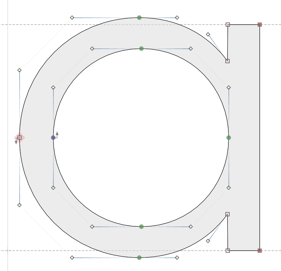
When I started designing the Mandator I knew I wanted it to feel strictly geometric, but still usable. The circle became the obvious starting point — every stroke, counter, and curve somehow relates back to it.
I began by drawing simple shapes on a grid, testing how far I could push the idea before it started to break. Some letters came easily, like "o" and "c"” but others were much more challenging. The goal was to build a system where every character felt like it belonged, but didn’t look forced.
I've started with designing the “a” and the “s.” For the “a,” I experimented with a double-storey form at first, but it felt too complex compared to the rest of the set. The single-storey “a” made more sense—it allowed me to use a nearly perfect circle for the counter and balance it with a straight vertical stroke. It looked clean and fit well with the rest. The “s” was a different kind of problem. Making it circular without it looking stiff was tough. I had to tweak the curves a lot, especially at the top and bottom, to avoid it looking like two bowls glued together. In the end, I found a shape that still felt round but had some natural movement to it.