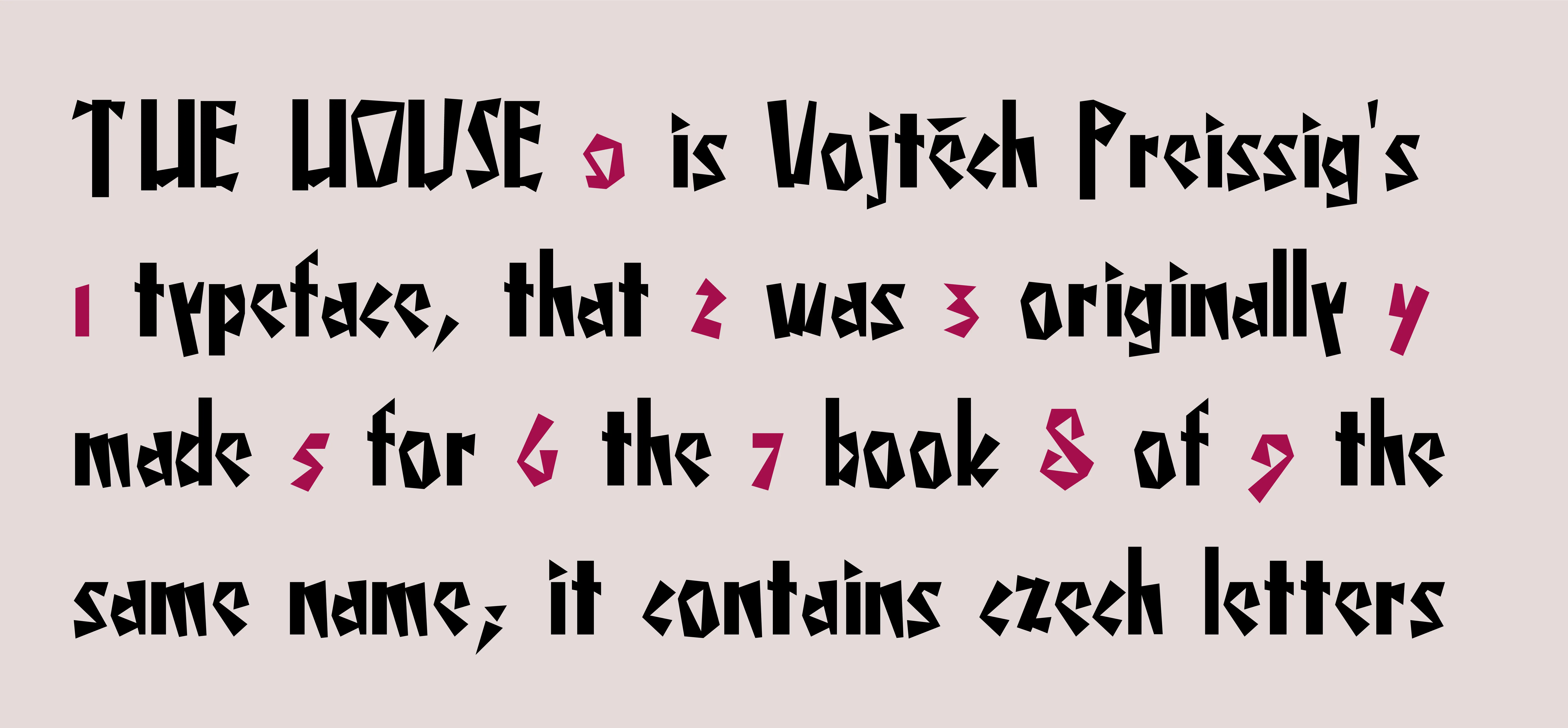
The house is an unconventional font. It can be used for posters, identity, webdesign or book titles. Vojtěch Preissig designed a typeface that he claimed was cubist. The typeface replaces curves with a wedge-shaped system of elements, which he also uses in a more moderate form in his Roman typeface.

The house

The House

Wrongly developed dreams or 4 harbingers of strangled sadness or when angels deserve only death

Wrongly developed dreams

Mandator is a stereotypical sans-serif font. The goal was to design typeface, that would be suitable for handbooks, book titles, bilboards but even on web as system font (it is used on this site).

Mandator

Mandator

Ponor is a serif book font. It is originating from the 16ᵗʰ century typeface called Garamond (especially from the metal type)... It does contain czech, french or some of polish accents, numbers, superior letters, ligatures, special symbols, etc...

Ponor

Ponor